This will be my front cover as the person in the photo is looking directly into the camera which makes it seem as though she is looking right at anyone who sees the magazine. Her pose is also rather similar to how contestants on the X Factor pose when they are in the finals and as she will be the winner of that competition for my magazine article, it will appear legitimate to customers.
I will use this photo for my contents page as it shows her with a microphone and creates an image of her as a singer which is what she is trying to portray.
I will also use this photo on my contents page to show other stories that are in my magazine. As my magazine will be aimed at a variety of people with different music tastes, this story will be of an indie singer. She is looking slightly away from the camera but looks sincere in what she is singing which could make the reader be interested in who she is.
This image will be used for my double page spread as it is wider than my other images due to the microphone stand being present. The microphone is being pointed into the camera as if asking the reader to sing along with her. This will make the reader feel included and want to read about her as they identify with her more.
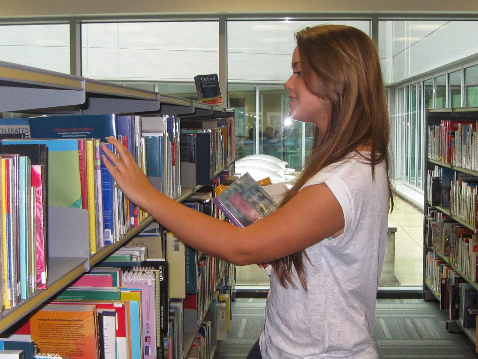
I will put these two photos into bubbles on the double page spread as an extra insight into her life behind the scenes. This will be rather small as it is not the main purpose of the article but it provides sympathy from the reader (knowing she was studying while working) and allows them to feel a more personal connection to her.


No comments:
Post a Comment