Thursday, 27 February 2014

Contents Page Progress


After using a newspaper-style layout for the coverlines on the cover I chose to continue the style with the framework of the contents page. I picked a font for the word 'contents' so that it would stand out so people would know what to expect on this page. I also continued the house style with the light red colour for the background.


I decided to have the main article to have a large space on the contents page than the other stories to make it clear that this was the main story. I chose an image of her holding a microphone so the reader knows she is a singer. I then put the page number over the image with a black background so it draws the reader's attention to the box and they know exactly where to go without having to search through the magazine.


I moved the image to the left side as when I put the photo for another story slightly overlapping that image as I had planned, it covered the microphone which ruined the image. I chose to have the other stories on a slant and overlapping that main story to appeal to a younger audience. Many publications that are aimed at a teenage audience use these techniques as they make it seem more edgy as well as having the effect of grabbing the reader's attention from the left image to see what is covering it. I had the background of the other stories as almost the same as the background colour for the page to stick to the house style. I kept the page number straight on a slanted image so that it is easier to read. I also added a tab to the page index with the same colour scheme as the page number boxes but with rounded edges to make them slightly different.


 I added a bevelled effect to the second story to make it look more 3-D like it is coming off the page. This is a similar technique to having the main image looking straight into the camera. I added the background for the next story underneath but kept this one straight as when I slanted it the other way, it did not look as effective as I had expected. I added tabs to two more sections which is what would be kept in all future issues. This is so the reader knows what they are looking at and can decide whether they want to read that section or not in advance. I made the page number for the main story larger so it is even more clear that this is the main story.


I started to add the names of other stories that I thought would be typical of a music magazine to include with page numbers down the right side. I changed the font of the Contents title as the former font looked too old fashioned and I did not think it would appeal to my target audience. I chose to have my competition prize as tickets to an upcoming festival as this is something members of my target audience would be interested in. During my audience research a lot of people said they would be more likely to buy a magazine if they offered the chance to win festival tickets. I put the word tickets in the same colour as the TitP logo because they are a part of the same title and it allows them to stand out on the black background. I included one of my own photos from a festival to get the reader excited about the concept of going to one.


Instead of having a white background, I made it light grey so it wasn't so harsh to look at. I also made the 'tickets' heading shorter, bolder, underlined and no longer in italics so that it stood out more. I then did something similar with the date at the top of the page so it looked bolder instead of thin and professional looking. Finally I completed the page index with more story titles, making sure each title was in line with the page number so it was easy to see which story corresponded with each number. I put information that could attract certain audiences in bold so it would stand out to the reader.


 I added an effect to the festival image to brighten it up and make it look sunnier with more of a 'festival feeling'. I got an image and gave it a black and white gradient effect to create a silhouette with an original image. I gave it an outer glow to make it look even darker and added question marks to add to the mystery which is the key selling point of that story.

Thursday, 20 February 2014

Double Page Spread Progress


Knowing how much space my chosen image would take up, I put it as far right as I could get it so it did not take up too much space. I found the middle of the page and inserted a line so I would know where each page would start and end which allowed me to cut a portion of the image to keep it on one page. I chose this image because the microphone is being held out to the reader and since it is so close to the edge, it almost looks like it is coming out of the page and encouraging the reader to join her. The line also allowed me to ensure part of my title was not cut off by the fold of the page. I chose a bold font for the title and addressed the reader telling them it is 'your' winner making them feel more involved with the artist. I kept the colour scheme by making the title red.


Because this is a double page spread that would be different in each issue I decided to make the title a brighter red colour for two reasons: so it wasnt too similar to the contents page and front cover while still incorporating similarities and also to make it a closer shade to the X Factor logo which is why the artist is known in the first place. I placed the logo behind the title because everyone will know what it is without having to see the whole thing but also so the title could be read as 'say hello to your x factor winner'. So I knew how much space I would have to work with I placed two bodies of text in the area that I would be putting the main article with a gap large enough to place a pull quote which is a common convention in most magazine articles. Inspired by an example of a music magazine I found online, I decided to have each line as a different font and shade of red with black quotation marks around it. Under the title I placed a subheading with the name of the artist on its own line in red. This is so the name stands out as she is the person it is about. The word 'exclusive' is in bold so the reader knows it is something only this magazine has access to.


Similarly to the contents page, I made the background a light grey colour instead of white to make it less harsh on the reader's eyes. I had the idea of putting smaller, less important images in a bubble which continues the conventions of a newspaper. I ensured it was surrounded by a red border to keep the colour scheme.


I added another bubble that slightly covers the first image as neither image is important enough to stand on its own so they almost become one image. I also included a caption so the reader knows why these images were included. I made the quotation marks around the pull quote larger and translucent so it could be placed over a part of the text.


After drafting an article and deciding this is what I would include, I placed in where I had originally planned which included an introduction to explain what the article would include. I put the questions in red so it was clear what was the answer. I also placed a large Q and A as a sort of drop cap so the reader knows where to look first. Since I had a caption for the bubble images I decided to include one for the main image but knew it would be confusing to know which caption was for each images therefore I put it into a red circle in the gap which also helped to fill in some empty space.


So the colour of the title was not too similar to the logo, I changed it to match the colour of the background of the other pages. I noticed that the border of one bubble image was different and so I made them both match and made them the same colour as the title to make a colour scheme. I made the inset caption more bold as I thought the DPS looked too bare compared to the other pages. I also added solid colour behind the article to help fix this issue.


 Despite being a different colour I didn't think 'Tanya Keenan' stood out enough so I changed the font and size of the text to make it more clear. I did the same with the rest of the introduction to make it easier to read. The block colour around the text did not look professional so I removed it from around the answers which meant the background around the questions stood out more. The questions were not very clear so I made the text white which made it much easier to read.

Sunday, 16 February 2014

Draft Article for Double Page Spread

She took everyone on the show by surprise with her out-of-the-box music style and impressive guitar playing skills and against all odds went on to beat the usual X factor suspects. Join us now as we have the first exclusive interview with the newest indie act to capture our hearts: Tanya Keenan.
Q Tanya, how does it feel to have so much support from the x factor viewers?
A Most people assume I don’t care as much as the other contestants because of how different I am to the people who usually go on this type of show but it honestly means so much to me that the public spent their own money to help me achieve my dreams and I wouldn’t be here without them. I am so grateful and would like to thank them from the bottom of my heart.
Q Were there any performances you enjoyed more than others?
A I’d have to say my first audition is what really got me to start believing in myself and my talent. If the audience had booed me off the stage I don’t think my ego would have taken it and it would have definitely swayed the judges towards giving me a no. I think you could probably tell from my reaction how shocked I was but I really appreciated their reaction and I’d never been more excited than at that moment.
Q Who helped you the most in the competition?
A Of course I owe all of my successful performances to my mentor for listening to how I play and the type of songs I was a fan of so when it came to choosing songs, it was always something I would enjoy playing on stage. This definitely made me more at ease when I was up there and since the majority of songs I performed were on my iPod at home; I wasn’t worrying about getting the words wrong. Off stage she gave me so much help too and was always asking if I missed home and encouraged me to talk about everything so that made me feel so much better.
Q Is there any of the contestants you will be staying in touch with?
A Everyone who was in the live shows is like my family now and I would love to keep in touch with every one of them but the girls in my group are a definite must. They were like the sisters I never had and we had such a good laugh together.
Q What about the people you didn’t necessarily get on with in the show?
A I know who you’re talking about but me and Jasmine have sorted everything out. There was basically some confusion about wardrobe choices that just got out of hand and things were said from the both of us that we regret. We’ve cleared the air now and I hope her and the rest of ‘Girlz Rock’go really far.
Q What are your plans for the future?
A At the minute I’m still adjusting to the idea that people know who I am and have heard me sing. I’m going to have to get used to that and once I’m feeling up to the challenge, I hope to start writing some songs with a couple of guys I’ve met through the show. I have a couple up my sleeve already that I’m really excited about recording and I can’t wait for all you guys to hear my first album when it is released!

Sunday, 9 February 2014

Main Task Flat Plans


 I tried to make sure all of the key factors in a front cover was included in my flat plan. This was a simple yet effective layout that I felt would be suitable for my style of magazine.
While making my magazine I decided it would look better for my masthead to spread all the way across the top of the page as this made it stand out more and made sure it did not look stretched. It also meant the image would cover the bottom of the masthead just as many of the real magazine examples do which usually shows that the magazine has a large enough reputation that it is recognised without being able to see the whole name. Therefore having the image cover part of the masthead creates the idea that this magazine is already rather popular which may influence others to purchase it.
I also decided not have images on the cover that make a link to other stories inside. This was mostly as to not draw attention away from the main image which, as the story suggests, would appeal to many people as she was on a popular TV show so a lot of people would recognise her even if they aren't a fan of the magazine so may buy it purely for that story especially as the word "exclusive" is used to make the reader think the magazine has connections to big stars and will possibly have more exclusive stories in the future.
Upon finishing, the date and price would no longer fit so I decided to put it under the masthead on the right so it is on the opposite side of the other piece of essential information- the barcode.


I will have the word Contents going across the top of the page so the reader knows what will be on this page. 
There will be three sections on my contents page. I will have a page index on the left to guide the reader to other stories which is where it is in all of the examples I have seen that include this convention. The images that show stories in the issue will have a larger section with a competition in a small box under this. The image of the main article will be in one half of the assigned section as this is the most important with three images for smaller stories overlapping down the side with the page numbers in different positions on top of the image.
The date will be above the title so the reader can easily see when the issue was released and so how up to date the stories and competitions are.


A popular convention of a double page spread is for the title to be at the top of the page as this is the first place the reader looks so they will know what the story is about. I decided to keep this convention as it makes sense to know if they will be interested in the article or not.
I will keep the use of an introduction so the reader will have more information about the person being discussed in the article before deciding whether or not to continue with the story.
My article will be in two columns with a large gap between the two. This is so the text is spread apart enough to make it easier to read as having too much text too close together can put off readers who do not want to take in too much information at once. It also leaves space to include a pull quote which is a convention that almost all magazines use so would be beneficial for me to include.
My main image will take up most of the opposite page but because it has been cut from the background, it means there is space for other images to be placed in a bubble and for captions for all images on the page.


Friday, 7 February 2014

Photograph Choices


This will be my front cover as the person in the photo is looking directly into the camera which makes it seem as though she is looking right at anyone who sees the magazine. Her pose is also rather similar to how contestants on the X Factor pose when they are in the finals and as she will be the winner of that competition for my magazine article, it will appear legitimate to customers.


I will use this photo for my contents page as it shows her with a microphone and creates an image of her as a singer which is what she is trying to portray.


I will also use this photo on my contents page to show other stories that are in my magazine. As my magazine will be aimed at a variety of people with different music tastes, this story will be of an indie singer. She is looking slightly away from the camera but looks sincere in what she is singing which could make the reader be interested in who she is.


This image will be used for my double page spread as it is wider than my other images due to the microphone stand being present. The microphone is being pointed into the camera as if asking the reader to sing along with her. This will make the reader feel included and want to read about her as they identify with her more.


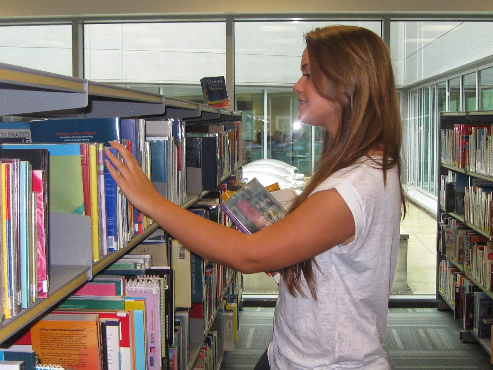
I will put these two photos into bubbles on the double page spread as an extra insight into her life behind the scenes. This will be rather small as it is not the main purpose of the article but it provides sympathy from the reader (knowing she was studying while working) and allows them to feel a more personal connection to her.


Wednesday, 5 February 2014

Masthead Fonts with Commentary


After choosing the name of my magazine, I tried to choose a font that would suit the style of the magazine as well as having some connotations of nature since the name relates to this topic. The colours are supposed to depict a sunset as this is usually what comes to mind when people think of a horizon, as well as being calming which may help attract people to the magazine.

After encorporating the chosen font onto my front cover, I decided it did not look as effective as I had hoped and instead browsed different fonts whilst it was already on the cover in the chosen colours. This allowed me to see if it would suit the magazine and be mature enough to attract a slightly older audience without being too intimidating for teenagers. This is my chosen masthead:


Tuesday, 4 February 2014

The Conventions, Producer and Target Audience of MyText

1.     I plan to have a masthead that represents the main themes of my magazine. For instance if I choose to use the name ‘Horizon’ or ‘Up&Coming’ it will be because my magazine focuses on upcoming talent which the name suggests. This will appeal to my target audience of teenagers because most people in this age range like to know about new music and trends before other people so they will read this magazine to be able to hear about new artists before anyone else. I will keep the font simple because I am also trying to appeal to people in their early twenties who may prefer a more professional look but if I make it too classy then the younger audience may be put off. I have chosen ‘Impact’ as it is legible and simple enough to appeal to all ages. My main image will be slightly covering the masthead but not so much as to make the customer unable to see it. This is because magazines such as NME often have the masthead behind the image because they know they are a big enough brand that it will still be recognised. Having the masthead slightly covered may make people think the magazine has a bigger reputation whereas people who have not seen it before will still know what it is called. The main image I have chosen has light reflecting on the girl’s glasses which creates the image of being under a spotlight. This is a beneficial effect as she is supposed to be the winner of a famous competition so she would be ‘in the spotlight’ at the time. She is looking straight in the camera which is a convention that many music magazines use to make the reader feel more connected to the person on the page. I will use a light red colour in all three of my pages to keep a house style but only a small amount on the double page spread as this would be different in each issue so it would not make sense to have it exactly the same as the contents page and cover.

2.     I would want Future Publishing to produce and distribute my magazine. I feel they would be interested in getting involved with my magazine as they have been in business with music magazines in the past that have not done very well in the market. This is because they are a different style of music magazine than the likes of Q, NME, MOJO etc. which tend to be more successful. While my magazine has elements that these magazines have, they focus on artists that are already in the public eye. While my magazine will incorporate these types of people as a way of appealing to a wider audience, my main focus is on new artists and this is a rather unseen concept. This means there is a niche in the market for my magazine and this company would be interested as it is clear they want to be in business with music magazines and mine would be the one to help them do it successfully.

3.     My target audience is people in their mid-teens to early twenties. It will be aimed at both genders using a neutral colour scheme and focussed more at a specific genre than characteristic. From audience research and personal experience I know that people are often more attracted to a magazine for who is on the cover/ the content rather than what the magazine is, although having a good reputation helps. A large portion of young people now want to be ahead of their friends when it comes to specific trends. I am aiming my magazine at the type of people who enjoy knowing about artists before they appear in mainstream charts. These people are likely to use social media websites such as Tumblr where posts can reach a large audience. If someone buys an issue and posts a photo of it online about a new artist they heard about in this magazine, more people with similar characteristics will want to see what it is. The issues that have well known artists on the cover will also appeal to a larger audience who listen to acclaimed artists. These people are more likely to use websites such as Facebook and Twitter so will be able to reach even more people in different soical groups.

4.     To reach the type of demographic I am focussing on, it would be beneficial to sell the magazine in places like music shops and tattoo/piercing parlours as many indie style young adults are often in these places. As a way of reaching a larger group of people it could also be sold in large supermarkets such as Asda and Tesco as this has worked well for other magazines such as NME and people of all ages go there every day. As these shops sell a large range of magazines, they would be interested in adding a slightly different genre to their collection that would stand out when next to other music magazines. If the magazine was successful enough in the first few months-year then I could make it available as an online issue as from my audience research I have found that a few people would be inclined to look at a magazine online rather than a physical copy. To ensure I do not lose out on a profit I would not have all of the content online or even as an app as if somebody likes what they see online, they may go to buy the same issue or a future one to find out what else the magazine has to offer. Because not a lot of other magazines offer the publication on a number of media platforms, this magazine will be seen as a modern product as well as accessing a larger audience.

Monday, 3 February 2014

Potential Magazine Mastheads


 Since my magazine will encorporate a lot of stories about upcoming artists who are not yet well known, up and coming seems like a relevant masthead for this magazine. I merged letters from existing font samples online that proved to be an effective font when it came to persuasive texts. I thought this could then be used for a magazine masthead as the colours are bright and draw attention whilst being a calming shade that would be appropriate for most ages.

I thought of the name 'Horizon' as the magazine mostly looks at unknown artists that are on the horizon. The colour of the masthead would represent a sunset as this is often thought of when imagining a horizon as well as being a rather calming colour palette. Having a sun behind the title also adds to this effect. I chose the font because the flicks make it appeal more to a younger audience as it is not a boring font whilst still being easy to read and not so much of a young looking font to be off putting to a slightly older audience.


'NCM' stands for Nicole Coulthard Magazine. This was a less imaginative idea but creates a brand that incorporates the name of the creator the way that plenty of other businesses have. The font puts the reader in the mind of a 1980s rock style and as bands such as the Beatles and Rolling Stones are becoming popular again with younger audiences, many people will be used to seeing this style of writing recently. This means that this font has connotations of a certain type of music which is what will be in the majority of my issues.